Lining up Tesla’s Highs and Lows from 2012 to 2019
April 15th, 2019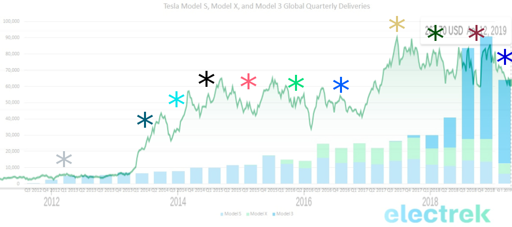
I will update the above image when the 2019 Q1 delivery graph from Electrek comes out. Here is 2018 Q4.
As you can see, in the beginning, the chart seems to follow closely to the deliveries.
*Summer 2011 to April 2013:
In Tesla's early stock years, you can see the deliveries and stock price aligning almost perfectly.
*to Sep 2013:
*to Feb 2014:
*to Sep 2014:
*to Jul 2015:
*to Feb 2016:
*to Dec 2016:
*to Jun 2017:
*to May 2018:
*to Dec 2018:
*to Apr 2019: -Model S and X production undergoing upgrade to refresh -920M debt repayment -Slower deliveries due to season -Slower deliveries due to Eu/China deliveries beginning -500M loan from Chinese banks +Unveil of FSD +Model SX refreshes +Gigafactory China rapid construction +Top selling Scandinavian Model 3. +Right hand drives begin production? +Enhanced Summon in EAP +Navigate on autopilot
Posted In:
ABOUT THE AUTHOR:Software Developer always striving to be better. Learn from others' mistakes, learn by doing, fail fast, maximize productivity, and really think hard about good defaults. Computer developers have the power to add an entire infinite dimension with a single Int (or maybe BigInt). The least we can do with that power is be creative.

 The Limiting Factor
 Whole Mars Catalog